In light of the health benefits associated with consumption of organic food and rise in the number of diseases on account of excessive chemical contamination of conventional food, the preference for organic food is growing rapidly. The gradual emergence of organic food as an essential part of the daily diet in India is also an encouraging sign towards the bright opportunities available for this sector in coming years. The organic foods market in India has almost quadrupled in size in last three years. The market which started off by occupying a handful of shelves at retail stores has nearly tripled its shelf space over the last five years. The challenge was standout with unique logo and Indian origin brand at same time. The main keywords were Natural / Earthy / Raw / India.
02. The Solution
As a first step in every branding project, we created a logo that fits the brand, which is bold with the nature-contested highlight. Client was very clear what he wanted. We started logo with very basic design styles. As an organic brand we wanted it to be lil rwa, unfinished logo. Different styles of fonts tried with same organic Green, Earth Brown and sometime Grey colours. For organic brand Leaf is the best element to play with and we tried different shapes from the shape of a leaf. Keeping client’s brief in mind we designed draft logos of different styles just to find the right path to complete this journey.
03. The Result
After finding the right path we put client’s all requirements in an interesting way to make it bolder & Indian origin organic brand. Shape of India’s map in logo was main requirement of the client. We put leaves together as a globe with a hint of India in it. And the font used was to keep it unfinished and raw look.
And the day came when the risk to remain tight in a bud was more painful than the risk it took to blossom.– Sushil Bhagat
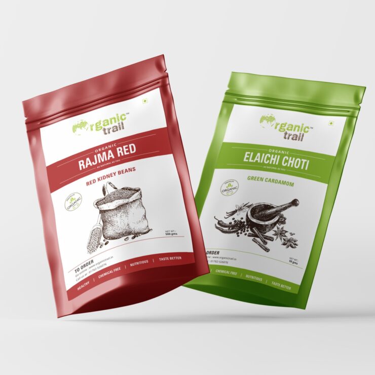
04. The Packaging
For the design of each product packaging, unique colour palettes were set that remind us of the product and its ingredients. We have also created illustrated patterns for each product. It helps viewers separate and differentiate packages in an easier way.